Multimedia Specialist | Brand Identity & Strategy | Web
STP Con 2023
Brand identity | app UI | Website | PRINT
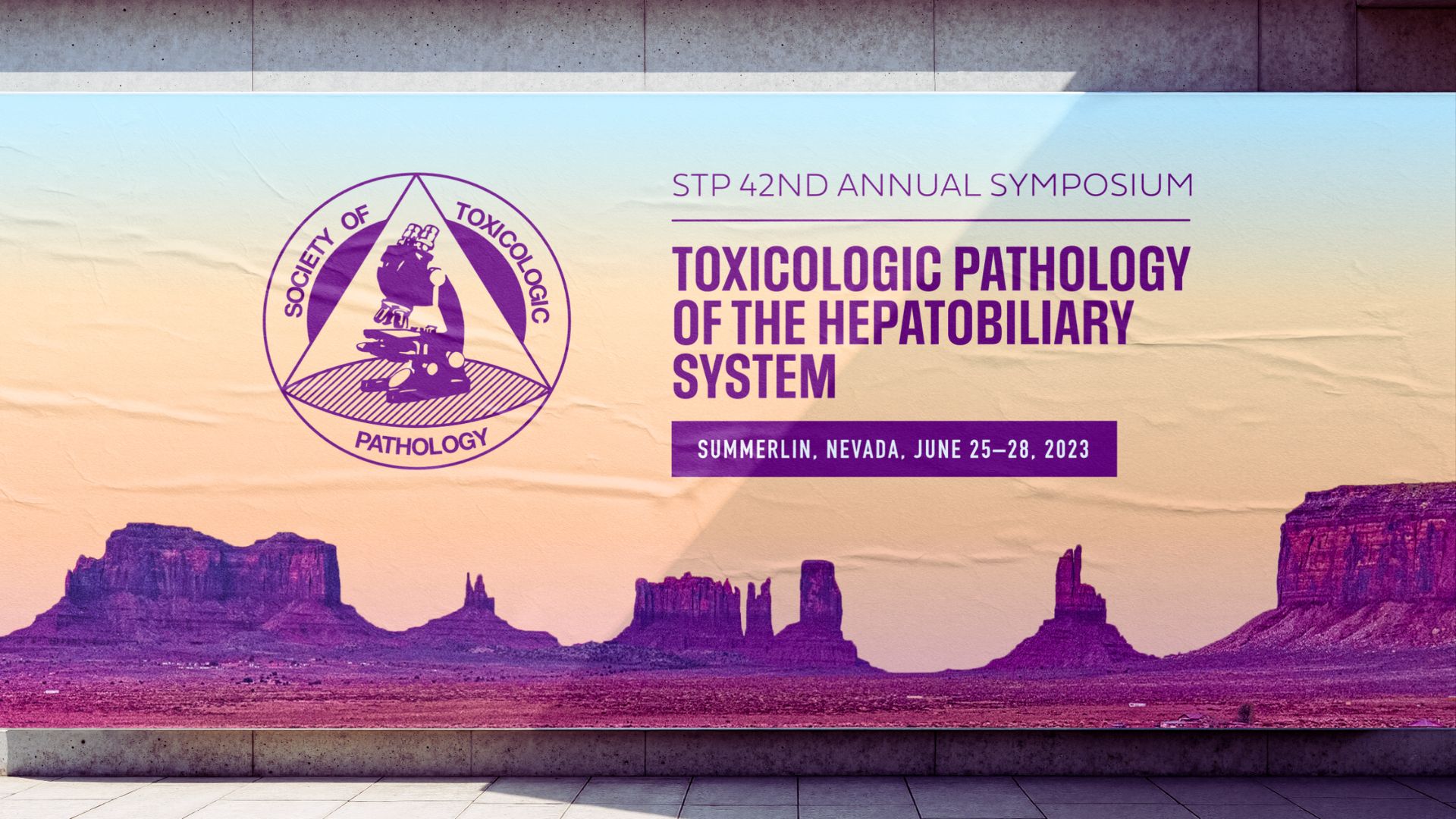
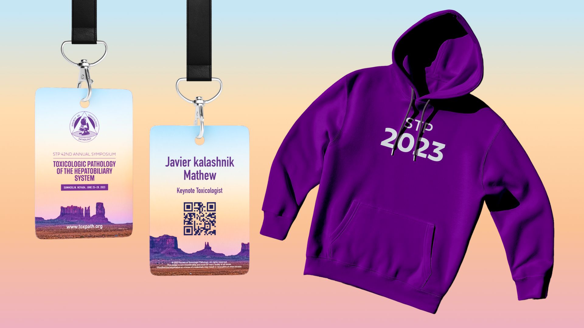
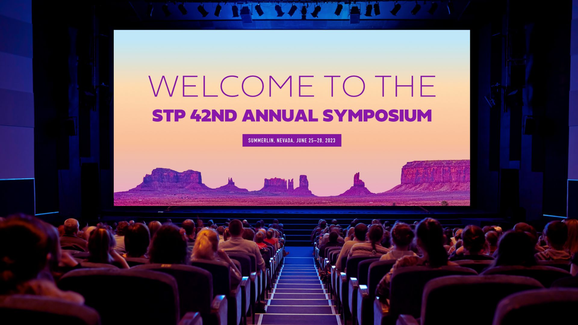
The Society of Toxicologic Pathology needed more than a conference theme — they needed an identity system that could carry a global scientific community through a full annual meeting experience in Las Vegas.
The strategic challenge was location. Las Vegas carries its own visual language, and the risk was either ignoring the setting entirely or leaning into it the wrong way. I chose a third path: using the Nevada landscape as a conceptual anchor. Sunrise gradients, desert calm, and landmark silhouettes weren't decorative choices — they were a metaphor for clarity, discovery, and new thinking. The kind of language that resonates with scientists without feeling like a tourism campaign.
Clean geometry and minimal typography kept the system grounded in scientific professionalism. The result was a brand that felt warm and human without sacrificing authority.
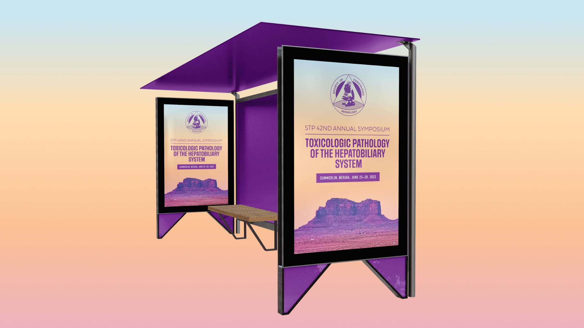
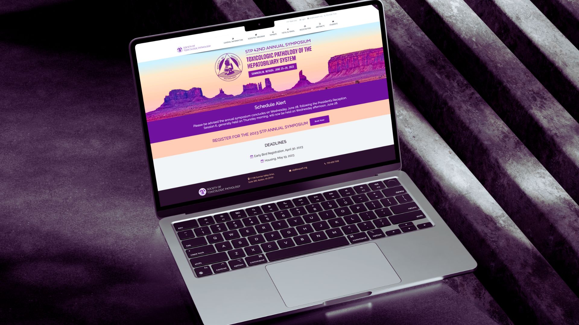
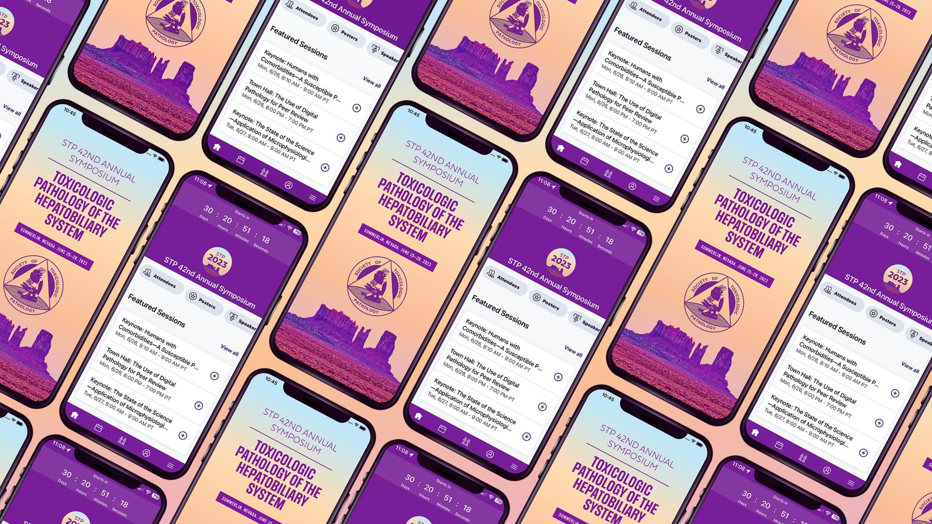
The identity was built as a scalable system — not a set of one-off assets — extending across event signage, digital graphics, web banners, app UI, and ID systems. Every element was designed for legibility and consistency across formats, giving STP a unified presence that reinforced their credibility as a global leader in toxicologic pathology and a flexible framework for future conferences.